HAAI!
A lot has happened since I last touched base with my blog. I quit from my year-long stint in Kolkata on my first job at Sabyasachi Couture, working closely with one of the most inspiring people in the Indian fashion industry; went through the most dramatic mood ups-&-downs (mostly the latter) in my life, met some pretty terrible people on the way & am back at home working on some pretty cool projects :)
Firstly, stuff I've been DYYYING to share, my work with Manta Ray Comics!
'Love Like A Sunset' (LLAS)
Part of my college diploma project. A script originally 12 pages, finally 18.
It's about a woman, Ila, who meets a boy, Suraj in a club. Things seem to be going great till... you read the comic and figure it out for yourselves ^_^
The amount of fun I had working on character design for this! And considering how it was done more than two years back, the thrill of finally holding the beautifully printed comic in my hands & having people see it is overwhelming.
Here's all the character design work that went into fleshing out the characters.
And below are some thumbnail roughs, and initial page layouts.
Two of the many discarded spreads; inking fail, mainly.
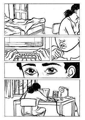
And here are some of the final pages! I was super-paranoid about the panel borders looking untidy, and ended up adding them digitally. That lead most people to believe the comic itself was done digitally, but it was painstakingly hand done + inked!
Here's the cover image for the comic. Type work by the incredible Prabha Mallya. I agree with people who feel cover image style should match what is inside it, otherwise it gets all misleading and annoying. Having said that, this seemed to work pretty well when we made it, and I don't hate it still; which is a rare case.
Next up some of the final pages from the 10 pager, 'My Beloved'.
You can get both these books online, here!
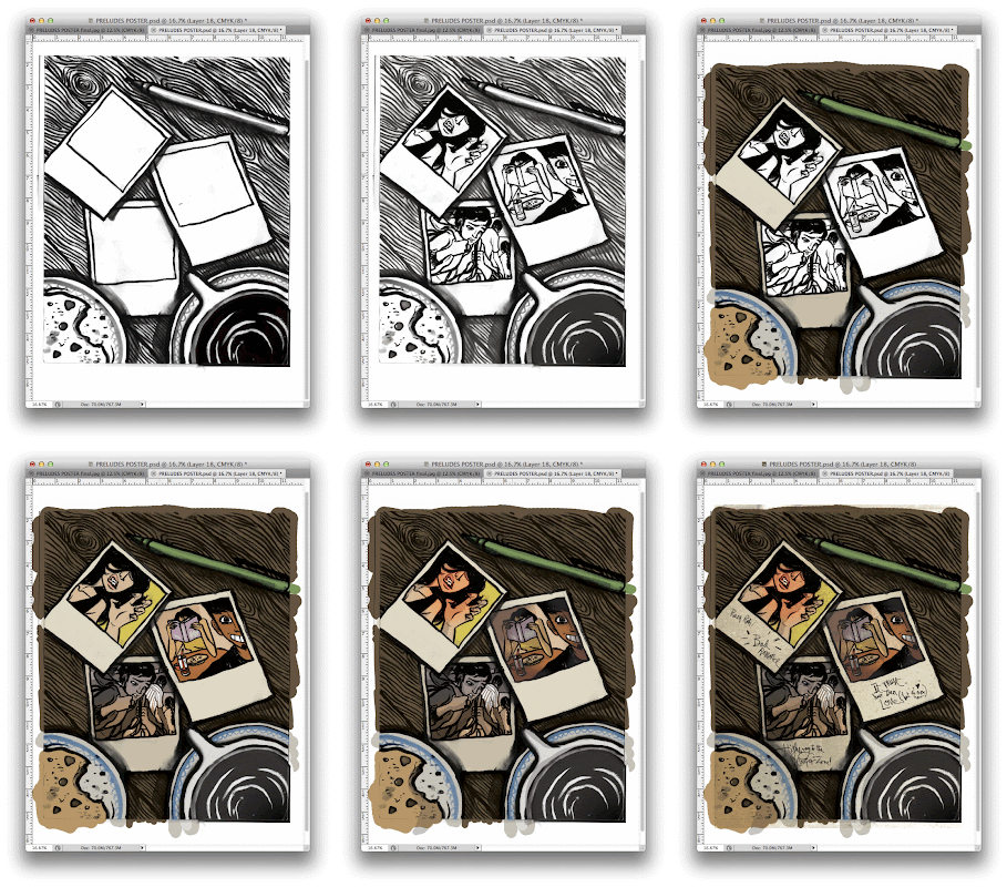
An image for a poster/ back cover for Manta Ray's 'Preludes'. Three polaroids. Three musical throwbacks on the three stories from the book. (Me, Pratheek & Prabha worked on those together!) It was pretty fun :)
Manta Ray wanted to create a poster for the launch of their two titles 'Mixtape' & 'Twelve: Preludes'. I took their story 'Rather Lovely Thing' and worked on this image. The story hit me as one quite brutal & raw, and that's exactly what I wanted to do with the poster. A powerful image, that would double up as an image for a poster. Poster design by the inimitable Prabha Malya.
I
also got to work on the cover image for Manta Ray's latest release 'Mixtape 2'. It's based on one of the shortest and the most powerful story from the collection called 'The Sea Within'. We worked on a killer deadline on this, and it's one of the very few pieces that came out exactly the way I pictured it. Below are some roughs+wip shots & the final cover.
Next up, I got to work on a feature for Marie Claire India, 'Inside the Minds of India's Top Designers' with Malika V Kashyap of Border & Fall. The idea was to get into the heads of six of India's leading fashion designers and see what gets them going. Accompanying the article were illustrations I did based on all six designers. It was so nice to get a personal peek into the designers' heads and be able to bring that about. Enough talk, here's the illos :)
Sabyasachi Mukherjee
My former boss. It was great fun to work under him for more than a year, and with this illustration I took some personal liberty in terms of what elements to include. I hope to continue working on many more projects with him.
Rajesh Pratap Singh
a minimalist fashion designer. He is known for his his great use of silhouette, textiles and textural embroidery. He also does installations made out of hundreds and hundreds of scissors! Like him, the illustration's mood is solemn and calm.
Rohit Bal
a fashion maverick from Kashmir, based out of Delhi. The illustration is almost the absolute opposite of how most people see him, at peace with his three boxer dogs, on a magic carpet, flying over a Kashmir valley.
Anamika Khanna
A designer who makes traditional garments with a modern spin. Her work is extremely beautiful and sophisticated, and that's just how we wanted to represent her, surrounded by a bubble of beauty (which is made of one of the motifs she uses often in her garments).
Manish Arora
I absolutely LOVE his work, and how he manages to amaze every season. Wanted to keep this one without outline yet very pop & vector-esque, included two designs from my recent favourite collections of his.
Manish Malhotra
The designer with Punjabi roots, known for high-glam Bollywood costumes. I wanted to focus on his association with cinema for this piece, elements from Bollywood blockbusters 'Kuch Kuch Hota Hai', Dilwale Dulhaniya Le Jayenge' and a shimmering costume from 'Radha' from Karan Johar's recent - rather blasphemous, yet vaguely entertaining - 'Student Of The Year'.
And here's what it looks like in the magazine, came out pretty neat in print :)
I worked with Pratham Books on a wonderful initiative, 'You Read They Learn'. The idea was to print short bilingual stories for children on a double spread of Hindustan Times, and for kids to be easily able to fold, cut & get a book out of it for free. In all there were three different stories. The story I worked on is called 'Tall, Taller, Tallest', explaining to kids a basic understanding of height. An earlier edition of the story was already in print, so I re-worked on the story to fit a new format and a more contemporary, endearing look. The whole story is up online here (the colors look way off there though)! One of the stories was also illustrated by the loverrly Priya Kurien (I was ECSTATIC to have my work alongside hers, I've always admired her children's book work in bookstores since I entered college, so here's a shoutout! :))Here are some of the illustrations from my story.


These were the first treatment sketches for the characters, I wanted the characters to reflect the light, fun mood of summer and it hopefully comes through.
And the happiness to see your work being circulated everywhere in Delhi + NCR and children everywhere reading the books was beyond any.
Pratham Books is also giving out 25,000 books, which means an entirely funded library for various schools & organisations! So this image was made for them to put it up on their Facebook page + blog. Please spread the word, it's a great opportunity for all of us to help feed the hunger for reading! More information
here &
here!
Some more funky-delicious work for Chumbak!
A fun tee with our very own Indian pehelwaans. Who could resist wearing a tee with these handsome men flexing & strutting?? They ain't showing on the website for me to link, which probably means they've sold out :O
Got an iPhone? Looking for a fun cover? These were my designs, and they look real nice printed.
The Pehelwaan, Muchhis of India & Things Indians Say! Get them,
here.
So many boxers! :D The response Chumbak got with the Muchhis of India boxers was pretty cray, they were sold out. So they're out with more moustaches in different colors!
There's autos, muchhis & monkeys going bananas in two delicious color combos. Get them
here :D
Here are some magnet designs I worked on.
The Pehelwaan magnet! For non-Hindi speakers 'Mera Naam Pehelwaan' literally translates to 'My name is Pehelwaan'.
Chai Samosa magnet, one just won't do without another on a rainy day!
The
Muchhi magnet, for all men whose glorious moustaches extend beyond a certain hipster trend of growing it during November.
All product photography ©Chumbak
Then I've been working with them folks at Penguin Books, India. *watery eyes*
My first Penguin cover illustration was for a book under the Indian fiction 'Metro Reads' collection, called 'Dirt Tracks' by Vivek Wilson. Below (left) is the final front image, (top right) the back illustration, (bottom right) an initial version of the final illo, had to change it because the characters had to look much younger.
Here's what the final cover looks like. Jacket design by
Aashim Raj.
And here's the book in print.
Then I worked on the cover illustration for 'The Best of Roald Dahl'! Who would have thought :)
Type + cover/ jacket design by Aashim Raj.
Here's the book in print.
Phew! There, another update hopefully a lot sooner! :)
Have a GRRRREAT day!
Feedback of all sorts welcome :D


